
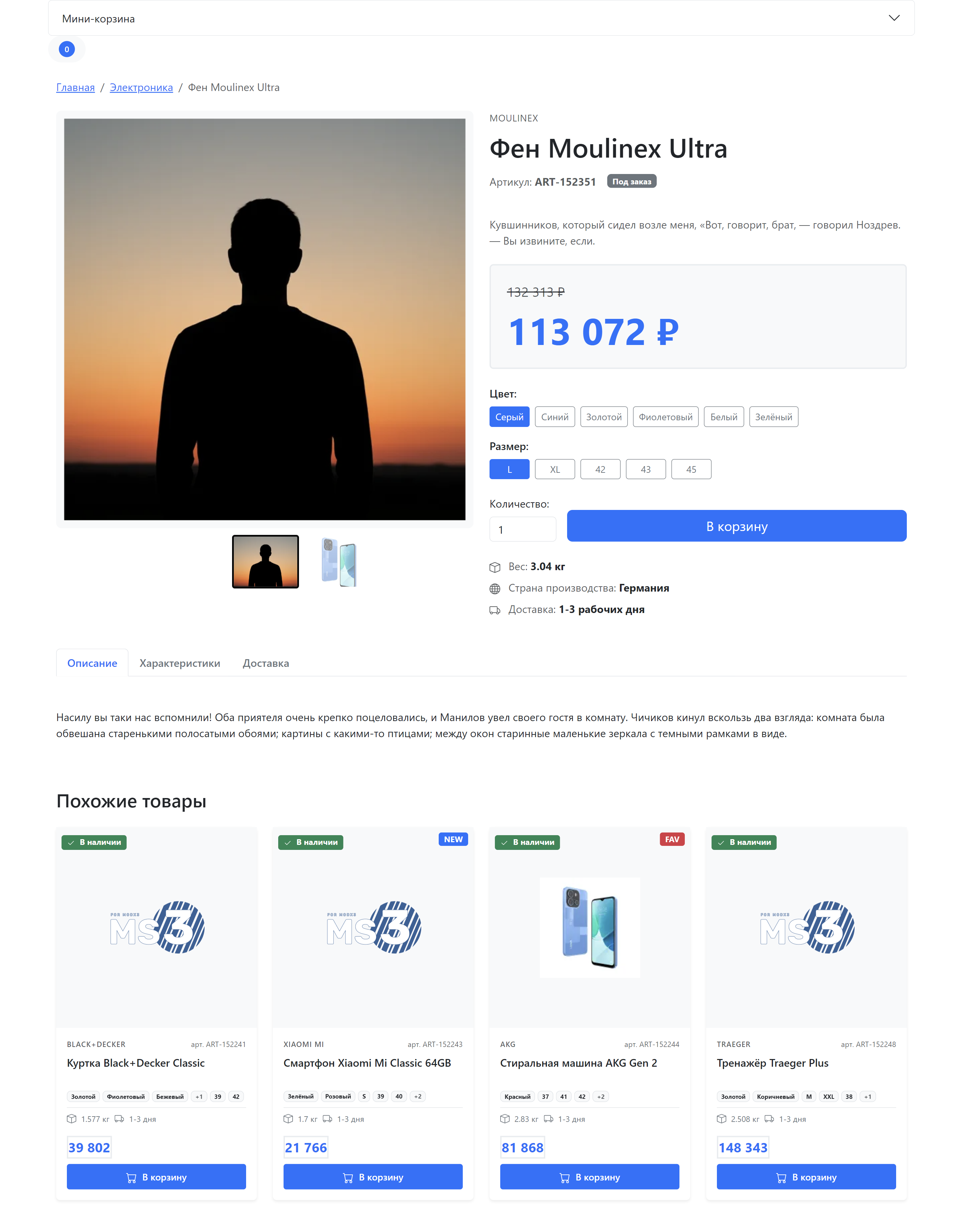
Product page
The product page shows a single product in detail: gallery, price, options, and add-to-cart form.
Page structure
| Component | File | Purpose |
|---|---|---|
| Page template | elements/templates/product.tpl | Product page layout |
| Gallery | tpl.msGallery | Image slider with lightbox |
| Product options | tpl.msProductOptions | Product attributes output |
Page template
Path: core/components/minishop3/elements/templates/product.tpl
The template extends the base template (base.tpl) and contains the following sections:
fenom
{extends 'file:templates/base.tpl'}
{block 'pagecontent'}
    <div class="container py-4">
        {* Breadcrumbs *}
        {* Main info (gallery + card) *}
        {* Tabs (description, specs, delivery) *}
        {* Related products *}
    </div>
{/block}
Page sections
Breadcrumbs
Navigation trail from home to the current product:
fenom
<nav aria-label="breadcrumb" class="mb-4">
    <ol class="breadcrumb">
        <li class="breadcrumb-item"><a href="/">Home</a></li>
        {if $_modx->resource.parent > 0}
            <li class="breadcrumb-item">
                <a href="/{$_modx->resource.parent | resource : 'uri'}">
                    {$_modx->resource.parent | resource : 'pagetitle'}
                </a>
            </li>
        {/if}
        <li class="breadcrumb-item active">{$_modx->resource.pagetitle}</li>
    </ol>
</nav>
Product gallery
The gallery uses Splide for the slider and GLightbox for full-size viewing.
fenom
{'!msGallery'|snippet: [
    'tpl' => 'tpl.msGallery'
]}
Gallery features
- Main slider — large images with fade effect
- Thumbnails — image navigation (hidden when there is only one photo)
- Lightbox — full-size view on click
- Lazy loading — deferred image loading
- Placeholder — shown when there are no images
Placeholders in tpl.msGallery
| Placeholder | Type | Description |
|---|---|---|
{$files} | array | Product image array |
{$file['url']} | string | Full image URL |
{$file['small']} | string | Thumbnail URL (small) |
{$file['medium']} | string | Medium size URL (medium) |
{$file['name']} | string | File name |
{$file['description']} | string | Image description |
See also: msGallery
Product information
The right column with product data includes:
Vendor and name
fenom
{if $vendor_name?}
    <div class="text-muted text-uppercase mb-2">
        {$vendor_name}
    </div>
{/if}

<h1 class="mb-3">{$_modx->resource.pagetitle}</h1>
SKU and stock status
fenom
<div class="d-flex align-items-center gap-3 mb-3">
    {if $article?}
        <span class="text-muted">SKU: <strong>{$article}</strong></span>
    {/if}

    {if $stock? && $stock > 0}
        <span class="badge bg-success">In stock</span>
    {else}
        <span class="badge bg-secondary">On order</span>
    {/if}
</div>
Product badges
| Badge | Condition | Style |
|---|---|---|
| NEW | {$new?} | badge bg-primary |
| BESTSELLER | {$popular?} | badge bg-warning text-dark |
| RECOMMENDED | {$favorite?} | badge bg-danger |
Price block
Price is shown in a separate block with background:
fenom
<div class="product-price mb-4 p-4 bg-light rounded">
    {if $old_price? && $old_price > 0}
        <div class="old-price text-muted text-decoration-line-through mb-2">
            {$old_price} ₽
        </div>

        {if $discount?}
            <div class="badge bg-danger mb-2">
                Discount {$discount}%
            </div>
        {/if}
    {/if}

    <div class="current-price display-4 fw-bold text-primary">
        {$price ?: 0} ₽
    </div>
</div>
Discount calculation
The discount percentage is calculated automatically by the msProducts snippet when old_price is set. Formula: (old_price - price) / old_price * 100
Product options
If the product has color or size options, they are rendered as buttons:
fenom
{if $_modx->resource.color?}
    <div class="option-group mb-3">
        <label class="form-label fw-semibold">Color:</label>
        <div class="d-flex flex-wrap gap-2">
            {foreach $_modx->resource.color as $colorOption}
                <button type="button" class="btn btn-outline-secondary btn-sm option-btn">
                    {$colorOption}
                </button>
            {/foreach}
        </div>
    </div>
{/if}
JavaScript activates the first option by default and handles clicks for switching.
Add to cart form
The page contains two forms with state switching:
"Add" state
Shown when the product is not in the cart:
fenom
<form method="post" class="ms3_form" data-cart-state="add">
    <input type="hidden" name="id" value="{$_modx->resource.id}">
    <input type="hidden" name="options" value="[]">
    <input type="hidden" name="ms3_action" value="cart/add">

    <div class="row g-3 align-items-end">
        <div class="col-auto">
            <label class="form-label">{'ms3_cart_count' | lexicon}:</label>
            <input type="number" name="count" value="1" min="1" class="form-control">
        </div>
        <div class="col">
            <button type="submit" class="btn btn-primary btn-lg w-100">
                {'ms3_cart_add' | lexicon}
            </button>
        </div>
    </div>
</form>
"In cart" state
Shown when the product is already in the cart:
fenom
<form method="post" class="ms3_form product-cart-controls-hidden" data-cart-state="change">
    <input type="hidden" name="product_key" value="">
    <input type="hidden" name="ms3_action" value="cart/change">

    <div class="row g-3 align-items-end">
        <div class="col-auto">
            <div class="input-group">
                <button class="btn btn-outline-primary dec-qty" type="button">−</button>
                <input type="number" name="count" value="1" min="0" class="form-control text-center">
                <button class="btn btn-outline-primary inc-qty" type="button">+</button>
            </div>
        </div>
        <div class="col">
            <button type="button" class="btn btn-success btn-lg w-100" disabled>
                ✓ {'ms3_cart_in_cart' | lexicon}
            </button>
        </div>
    </div>
</form>
Switching happens automatically through the ProductCardUI JavaScript module on the ms3:cart:updated event.
Additional information
Block with icons for weight, country of origin, and delivery:
fenom
<ul class="list-unstyled mb-0">
    {if $weight? && $weight > 0}
        <li class="mb-2">
            <svg width="16" height="16"><use href="#icon-box"/></svg>
            <span class="text-muted">Weight:</span> <strong>{$weight} kg</strong>
        </li>
    {/if}
    {if $made_in?}
        <li class="mb-2">
            <svg width="16" height="16"><use href="#icon-globe"/></svg>
            <span class="text-muted">Country of origin:</span> <strong>{$made_in}</strong>
        </li>
    {/if}
</ul>
Information tabs
Bootstrap tabs for organizing content:
| Tab | Content |
|---|---|
| Description | Full description from {$_modx->resource.description} |
| Specifications | Product properties table |
| Delivery | Delivery methods information |
fenom
<ul class="nav nav-tabs mb-4" role="tablist">
    <li class="nav-item">
        <button class="nav-link active" data-bs-toggle="tab" data-bs-target="#description">
            Description
        </button>
    </li>
    <li class="nav-item">
        <button class="nav-link" data-bs-toggle="tab" data-bs-target="#specs">
            Specifications
        </button>
    </li>
    <li class="nav-item">
        <button class="nav-link" data-bs-toggle="tab" data-bs-target="#delivery">
            Delivery
        </button>
    </li>
</ul>

<div class="tab-content">
    <div class="tab-pane fade show active" id="description">
        {$_modx->resource.description}
    </div>
    <!-- ... other tabs ... -->
</div>
Specifications table
Filled automatically from product fields:
| Field | Placeholder |
|---|---|
| SKU | {$article} |
| Vendor | {$vendor_name} |
| Country of origin | {$made_in} |
| Weight | {$weight} |
| Available colors | {$_modx->resource.color} (array) |
| Available sizes | {$_modx->resource.size} (array) |
Related products
Block with products from the same category:
fenom
<div class="related-products mt-5">
    <h3 class="mb-4">Related products</h3>
    <div class="row">
        {'!msProducts' | snippet : [
            'tpl' => 'tpl.msProducts.row',
            'parents' => $_modx->resource.parent,
            'resources' => '-' ~ $_modx->resource.id,
            'limit' => 4,
            'formatPrices' => 1,
            'withCurrency' => 0
        ]}
    </div>
</div>| Parameter | Value | Purpose |
|---|---|---|
parents | Parent category ID | Products from the same category |
resources | - current product ID | Exclude the current product |
limit | 4 | Show 4 products |
Product placeholders
The product page exposes all fields from the msProduct and msProductData tables:
Main fields
| Placeholder | Type | Description |
|---|---|---|
{$_modx->resource.id} | int | Product resource ID |
{$_modx->resource.pagetitle} | string | Product name |
{$_modx->resource.introtext} | string | Short description |
{$_modx->resource.description} | string | Full description |
{$_modx->resource.parent} | int | Parent category ID |
{$_modx->resource.uri} | string | Product URL |
msProductData fields
| Placeholder | Type | Description |
|---|---|---|
{$article} | string | SKU |
{$price} | float | Price |
{$old_price} | float | Old price |
{$weight} | float | Weight |
{$stock} | int | Stock quantity |
{$vendor_id} | int | Vendor ID |
{$vendor_name} | string | Vendor name |
{$made_in} | string | Country of origin |
{$new} | bool | "New" flag |
{$popular} | bool | "Popular" flag |
{$favorite} | bool | "Recommended" flag |
Product options
| Placeholder | Type | Description |
|---|---|---|
{$_modx->resource.color} | array | Available colors |
{$_modx->resource.size} | array | Available sizes |
{$discount} | int | Discount percentage (calculated) |
Customization
Creating a custom template
- Copy
product.tplto your theme folder - Make the required changes
- Assign the template to products in the Manager
Changing the gallery
Create your own chunk and specify it in the call:
fenom
{'!msGallery'|snippet: [
    'tpl' => 'myCustomGallery'
]}
Adding custom tabs
Extend the tabs block in the template:
fenom
<li class="nav-item">
    <button class="nav-link" data-bs-toggle="tab" data-bs-target="#reviews">
        Reviews
    </button>
</li>

<div class="tab-pane fade" id="reviews">
    {'!msProductReviews' | snippet : ['product' => $_modx->resource.id]}
</div>
CSS classes
| Class | Element |
|---|---|
.product-info | Product information container |
.product-price | Price block |
.product-options | Options container |
.option-group | Option group (color, size) |
.option-btn | Option selection button |
.product-meta | Additional information |
.product-tabs | Tabs container |
.related-products | Related products block |
.ms3-gallery | Gallery container |
.ms3-gallery-main | Main slider |
.ms3-gallery-thumbs | Thumbnail slider |
Dependencies
The template uses the following libraries:
| Library | Version | Purpose |
|---|---|---|
| Bootstrap 5 | 5.3.3 | CSS framework |
| Splide | 4.1.4 | Gallery slider |
| GLightbox | 3.3.0 | Image lightbox |
Libraries are loaded via CDN. For production, use local copies.