
Product catalog
The catalog is the main store page that displays a list of products from a category. MiniShop3 provides a ready-made template and product card chunk.
Catalog structure
The catalog consists of two components:
| Component | File | Purpose |
|---|---|---|
| Category template | elements/templates/catalog.tpl | Page layout, msProducts snippet call |
| Product card chunk | elements/chunks/ms3_products_row.tpl | Appearance of a single product in the grid |
Category template
Path: core/components/minishop3/elements/templates/catalog.tpl
The template extends the base template (base.tpl) and contains:
fenom
{extends 'file:templates/base.tpl'}
{block 'pagecontent'}
    <div class="container py-4">
        <main>
            {* Category title *}
            <div class="page-header mb-4">
                <h1>{$_modx->resource.pagetitle}</h1>
                {if $_modx->resource.introtext}
                    <p class="lead text-muted">{$_modx->resource.introtext}</p>
                {/if}
            </div>

            {* Product grid *}
            <div class="row">
                {'!msProducts' | snippet : [
                    'tpl' => 'tpl.msProducts.row',
                    'includeThumbs' => 'small,medium',
                    'includeVendorFields' => 'name,logo',
                    'formatPrices' => 1,
                    'withCurrency' => 1,
                    'limit' => 12,
                    'sortby' => 'menuindex',
                    'sortdir' => 'ASC',
                    'showZeroPrice' => 0
                ]}
            </div>
        </main>
    </div>
{/block}
Key call parameters
| Parameter | Value | Purpose |
|---|---|---|
tpl | tpl.msProducts.row | Product card chunk |
includeThumbs | small,medium | Load image thumbnails |
includeVendorFields | name,logo | Include vendor data |
formatPrices | 1 | Format prices (spaces, decimals) |
withCurrency | 1 | Add currency symbol |
showZeroPrice | 0 | Hide products with no price |
More on parameters
See the full parameter list in the msProducts snippet documentation.
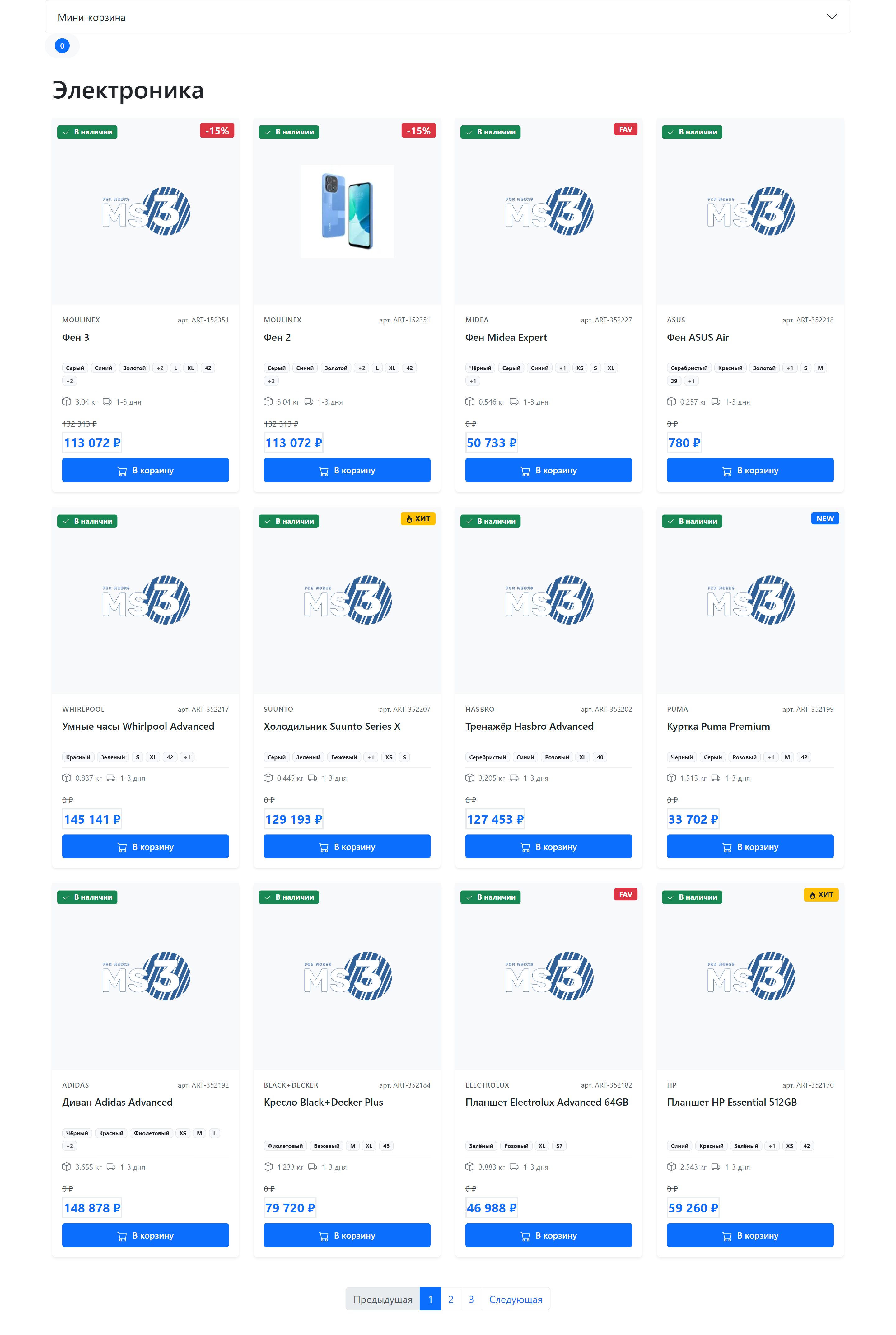
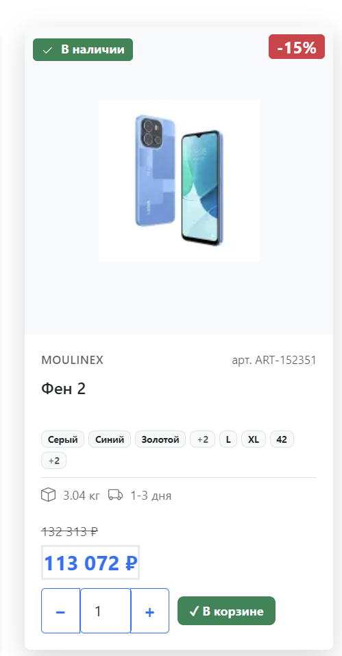
Product card
Path: core/components/minishop3/elements/chunks/ms3_products_row.tpl
Chunk name in DB: tpl.msProducts.row
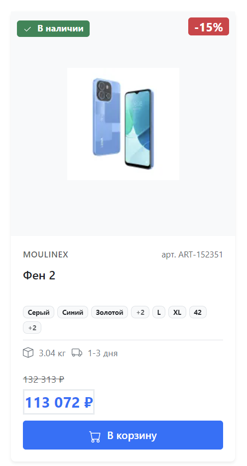
The card is built on Bootstrap 5 and includes:
Card elements
- Image with hover effect and "Quick view" overlay
- Status badges: in stock, discount, NEW, POPULAR, favorite
- Product info: vendor, SKU, name
- Product options: color, size (first 3 + count of others)
- Price: old and current with formatting
- Cart buttons: adaptive state
Badges and labels
The card automatically shows badges based on product data:
| Badge | Condition | Position |
|---|---|---|
| In stock / On order | {$weight > 0} | Top left |
| Discount (-XX%) | {$discount > 0} | Top right |
| NEW | {$new} | Top right |
| POPULAR | {$popular} | Top right |
| FAV | {$favorite} | Top right |
Cart button states
The card contains two forms, toggled by the ProductCardUI JavaScript module:
"Add" state — product not in cart:
html
<form class="ms3-add-to-cart" data-cart-state="add">
    <button type="submit">Add to cart</button>
</form>
"In cart" state — product already added:
html
<form class="ms3-cart-controls" data-cart-state="change">
    <button class="dec-qty">−</button>
    <input name="count" value="1">
    <button class="inc-qty">+</button>
    <span>✓ In cart</span>
</form>
Switching happens automatically on the ms3:cart:updated event.
Schema.org microdata
The card includes markup for search engines:
html
<div itemtype="http://schema.org/Product" itemscope>
    <meta itemprop="name" content="{$pagetitle}">
    <meta itemprop="description" content="{$description}">
    <img itemprop="image" src="{$thumb}">

    <div itemprop="offers" itemscope itemtype="http://schema.org/Offer">
        <meta itemprop="price" content="{$price}">
        <meta itemprop="priceCurrency" content="RUB">
        <link itemprop="availability" href="http://schema.org/InStock">
    </div>
</div>
Responsive grid
Cards use Bootstrap Grid with responsive classes:
html
<div class="col-12 col-sm-6 col-md-4 col-lg-3">| Screen | Products per row |
|---|---|
| < 576px (mobile) | 1 |
| ≥ 576px (sm) | 2 |
| ≥ 768px (md) | 3 |
| ≥ 992px (lg) | 4 |
Customization
Changing the category template
- Copy
catalog.tplto your theme - Adjust msProducts call parameters
- Assign the template to categories in the Manager
Changing the product card
- Create your own chunk, e.g.
tpl.myProducts.row - Specify it in the call:
'tpl' => 'tpl.myProducts.row'
Adding filters
To filter products, use the mFilter2 component or add where and optionFilters parameters:
fenom
{'!msProducts' | snippet : [
    'tpl' => 'tpl.msProducts.row',
    'where' => ['Data.vendor_id' => 5],
    'optionFilters' => ['color' => 'red']
]}
Pagination
For paged navigation, wrap the call in pdoPage:
fenom
{'!pdoPage' | snippet : [
    'element' => 'msProducts',
    'tpl' => 'tpl.msProducts.row',
    'limit' => 12
]}

<nav class="mt-4">
    {'page.nav' | placeholder}
</nav>